4.3 What are we looking for?
In the Introduction to this book, the importance of keeping a clear focus on the problem we are tackling was emphasised. This remains true when we explore the data graphically. We should be guided by the questions we are asking. However, visualisation can also be helpful in basic data screening and sanity checks. This section will illustrate both of these approaches.
It will also briefly cover some of the standard methods of visualisations for simple forms of data. The focus will be on simple simple but commonly occurring problems:
- what is the pattern of variation in single groups of data?;
- how do different groups compare?;
- what is the relationship between different measurements?
At the same time, we need to be aware of the different scales of measurement with which we may be dealing. These include:
- continuous scales where, in principle, any value can be observed along a continuous numerical interval (although rounding to a practical level of accuracy may influence the recorded value);
- discrete scales where the values correspond to integers, usually describing a count;
- categorical scales where the recorded value simply indicates the group, out of a finite number of groups, into which the observation falls, for example a blood group; categorical scales are ordinal when the groups have a natural and meaningful ordering and nominal when they do not.
We will begin with the description of an interesting historical dataset which will be used to illustrate the issues and methods.
Example: Longevity and paternal age at birth
The biological process of ageing is the focus of a great deal of current research. In fact, this topic has a very long history and one of the earliest studies came from a surprising source. Alexander Graham Bell was a Scottish-born scientist and inventor who moved to North America where he played a crucial role in the development of the telephone and became a co-founder of the American Telephone and Telegraph Company (AT&T). His scientific interests were much wider than this and included some early work on heredity. As part of this, he organised meticulous records on the descendants of one of the early European settlers in the ‘New World’. This was William Hyde, who died in 1681 and whose descendants are documented in the “Genealogy of the Hyde Family,” by Reuben H. Walworth, LL. D. (1864). A. G. Bell arranged for relevant dates to be extracted from which, among other things, the age of each father at a child’s birth and the subsequent age at death of the child could be calculated. He reported his findings on the dataset in general, and on the relationship between father’s age and child’s longevity in particular, in Bell (1918).The report on the analysis by Bell gives summary data and interpretation, with the raw data listed in Bell’s journal, the Beinn Bhreagh Recorder. This is held by the US Library of Congress who kindly gave access for the data to be transcribed. This information is provided in the
hydedataset, accessible through therp.datalinkfunction in therpanelpackage.
The datafile contains three columns. The first two give the age of the father and the age of the child. To provide a compact data representation, the third column gives the frequency of this particular age combination. Standard plotting functions generally expect each row to refer to an individual. We can easily expand the dataframe into this form, using the rep function. The code below creates an indicator variables ind which repeats each row number, as dictated by its frequency. The dataframe is then overwritten by its expanded form.
##   Father Child Frequency
## 1     17    10         1
## 2     20    14         1
## 3     21     0         2
## 4     21     1         1
## 5     21     4         1
## 6 21 6 1## Father Child
## 1 17 10
## 2 20 14
## 3 21 0
## 3.1 21 0
## 4 21 1
## 5 21 44.3.1 Continuous scales
The key question which motivated the collection of the data is whether the age of the father is linked, on average, to the age of the child. Before exploring that question, it might be useful to inspect the pattern of ages for fathers and children separately.
Are these ages on a continuous or a discrete scale? The ages of the fathers are mostly between 20 and 60 while the ages of the children are mostly between 0 and 100. Although the ages are rounded to a whole number of years, the resolution on the axes is fairly high, with a large number of distinct, evenly-spaced values. It would therefore be reasonable to treat this as a continuous scale. Measurements on any continuous scale can only be recorded to some specific degree of accuracy.
For data on a continuous scale, a histogram, where we display the frequency of data in grouped form, is an obvious method of data visualisation. The two upper panels in the figure below show the observations along the years scale with some random jittering and the use of transparency to reduce the problem of overplotting and allow individual observations to be seen. Construction of a histogram involves splitting the axis into intervals or bins, as illustrated by the grid of blue lines, and recording the frequency of observations in each bin. The number of intervals can be altered to allow us to view the underlying pattern in the distribution at different scales. A histogram can be produced by instructions of the form
ggplot(hyde, aes(Father)) + geom_histogram()although the panels below have been further annotated to illustrate the method of construction.
A striking feature of these histograms is the very high level of childhood mortality.
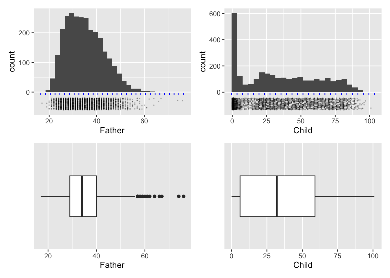
The bottom row of the figure above shows another common form of display for samples of data on a continuous scale, namely the boxplot. This is based on a summary of each set of data. The median of a sample is the value which has half of the observations below and half of the observations above. (If the number of data points in the sample is odd this will be the middle observation. If the number of data points is even, it is defined as the average of the middle two observations.) Reapplying this thinking to the lower and upper half of the dataset produces the lower and upper quartiles as the middle points of each half. The median and quartiles give a useful summary of the location and spread (distance of the quartiles from the median) of the sample of data. Two further summary numbers are usually added. These could be the extremes (largest and smallest observations) or other values indicating where the ‘tails’ of the sample lie. (There are various algorithms for this latter approach but the details are not crucial here. This allows a small number of unusually large or small data points to be identified separately.) This summary is turned into graphical form through a box whose edges lie at the quartiles, with a central line marking the median and a horizontal line marking the ‘extent’ of the data points. Boxplots can be produced by instructions of the form
ggplot(hyde, aes(Father)) + geom_boxplot()In the panels above the layer scale_y_discrete() has been added to remove the vertical scale which, for a single group of data is not relevant.
Useful as this is, a summary based on such a small number of sample characteristics cannot capture much detail. In this case the skewness of the distribution of father’s age is expressed through the median being positioned closer to the lower quartile than the upper quartile, but the clustering of observations due to child mortality is completely missed.
It is the relationship between father’s age and child’s longevity which is of interest, so a scatterplot of these two variables in the left hand plot below gives an initial impression. At any father’s age, there is huge variation in the child’s longevity so there is little indication of any underlying relationship. However, one unusual feature is apparent, with a vertical gap at father’s age 36 in an otherwise dense plot. Review of the transcription of the data brought to light that a group of observations has been mistakenly tagged with father’s age 35 when this should have been 36. Correction of this transcription error produces the right hand scatterplot, where the anomalous gap has disappeared. This is a simple example of another of the useful roles of data visualisation, namely data screening.
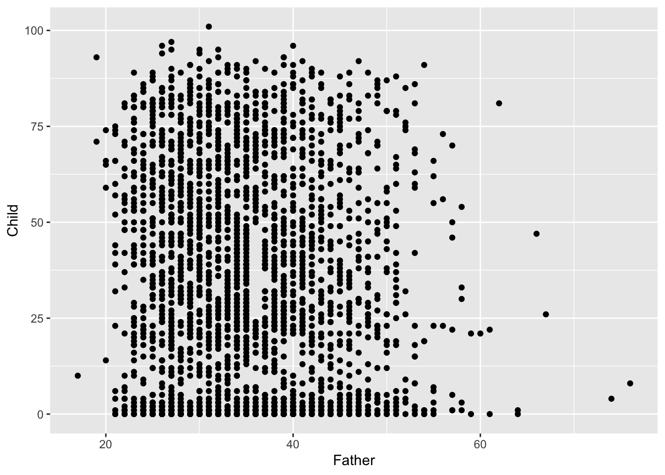
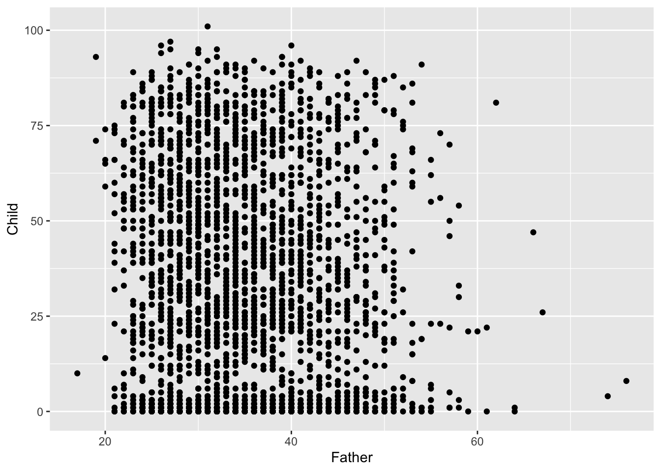
The high rate of child mortality is again apparent, now in the cluster of observations near the horizontal axis. In addition to the normal process of adult ageing there is a heightened challenge, relative to modern standards, to reach maturity. It may be helpful to separate these two effects by examining any relationship between father’s age and:
- the proportion of children who survive childhood;
- longevity for those who survive childhood;
- age of death for those who do not survive childhood.
The definition of ‘surviving childhood’ needs some thought. For current exploratory purposes, a suitable criterion would be to reach age 10 as this broadly corresponds to a ‘thinning’ of the data at this point on the vertical scale.
In order to explore whether there is evidence of a link between father’s age and child’s longevity, Alexander Graham Bell reported the mean child longevity for different groups of father’s age. We will do the same, but apply this to to those who survived childhood rather than to the whole dataset. We begin by adding Father_age_group to the hyde datasetfiltering out the cases where childhood was survivied. The fact that the dplyr package works with the enhanced form of dataframe called a tibble now helps, as this allows the group_by function to summarise child longevity by sample mean and sample standard deviation across the father’s age groups. The mean of the father’s ages in each group is also calculated. The mean of a group of observations can be thought of as its ‘centre of gravity’ if each observation corresponds to a weight resting at that point on the axis. It therefore summarises location of the sample. The sample standard deviation measures how far the observations are from the sample mean, on average, using squared distance to do so but putting this back on the original scale by taking the square root of the result. This therefore summarises the spread of the sample.
hyde    <-  mutate(hyde,
              Father_age_group = cut(Father, breaks = c(0, 25, 35, 45, 100)))
hyde_10 <- filter(hyde, Child >= 10)
hyde_10_means <- hyde_10 %>%
   group_by(Father_age_group) %>%
   summarise(mean = mean(Child), sd = sd(Child), age = mean(Father))
hyde_10_means
## # A tibble: 4 × 4
## Father_age_group mean sd age
## <fct> <dbl> <dbl> <dbl>
## 1 (0,25] 51.1 22.0 23.6
## 2 (25,35] 48.2 22.3 30.5
## 3 (35,45] 46.8 22.0 39.8
## 4 (45,100] 46.2 22.8 49.7We can now look for a trend in child longevity against father’s age by adding sample means to the scatterplot, for those cases where the child survived at least until age 10. This shows a small but steady decline in the mean child longevity as father’s age increases. This simple but effective form of insight, employed by Alexander Graham Bell on the full dataset, is regarded as the first indication of a link between the age of the father and the longevity of the child. The effect is small, so this is about understanding the underlying connection between these variables. It is certainly not feasible to predict the longevity of individual children from the father’s age!
At this stage, we are still dealing with descriptions of the data. We will have to defer the business of weighing evidence for change more carefully until we have the inferential tools introduced in Chapter 6.
# Notice that the second instance of geom_point replaces the default `data`
# with the hyde_10_means dataset and the appropriate `aes`.
filter(hyde, Child >= 10) %>%
   ggplot(aes(Father, Child)) + geom_point() +
   geom_point(aes(age, mean), data = hyde_10_means, size = 5, col = "red") +
   geom_vline(xintercept = c(25, 35, 45), col = "red", linetype = 2)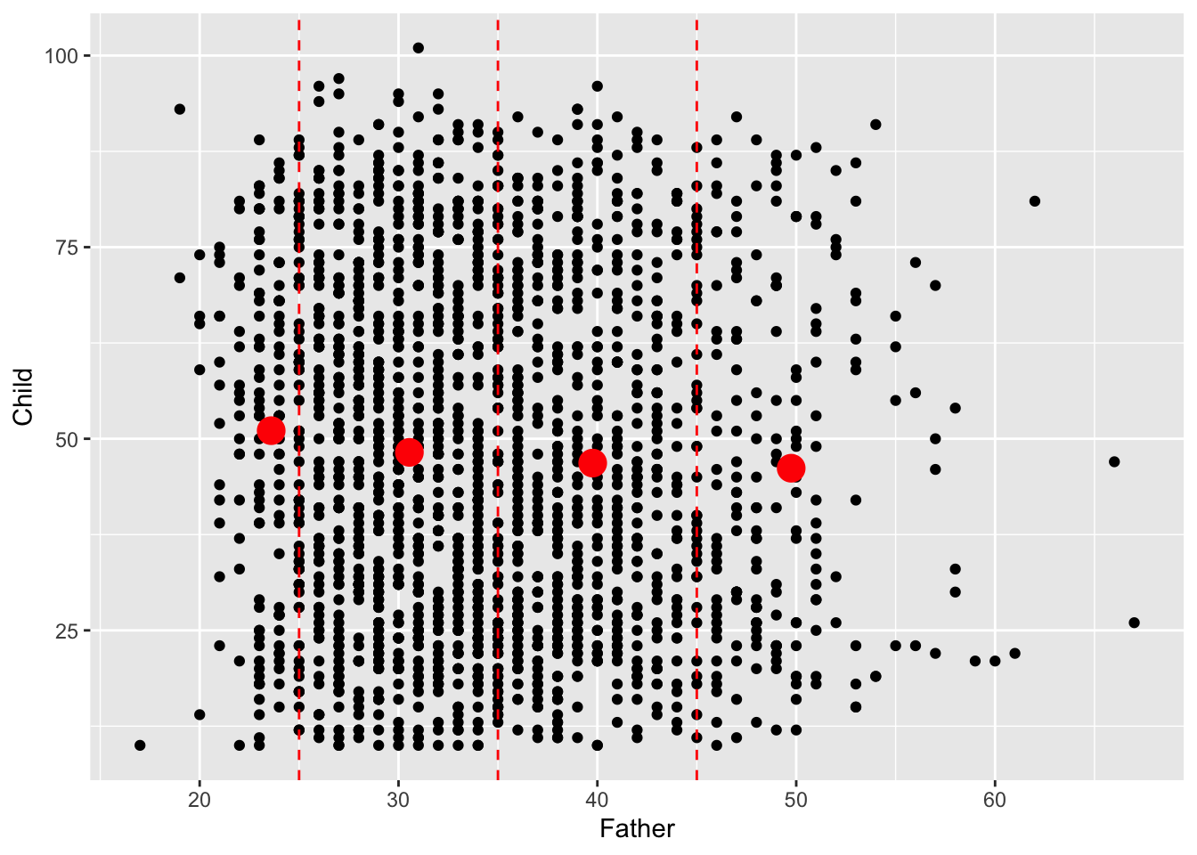
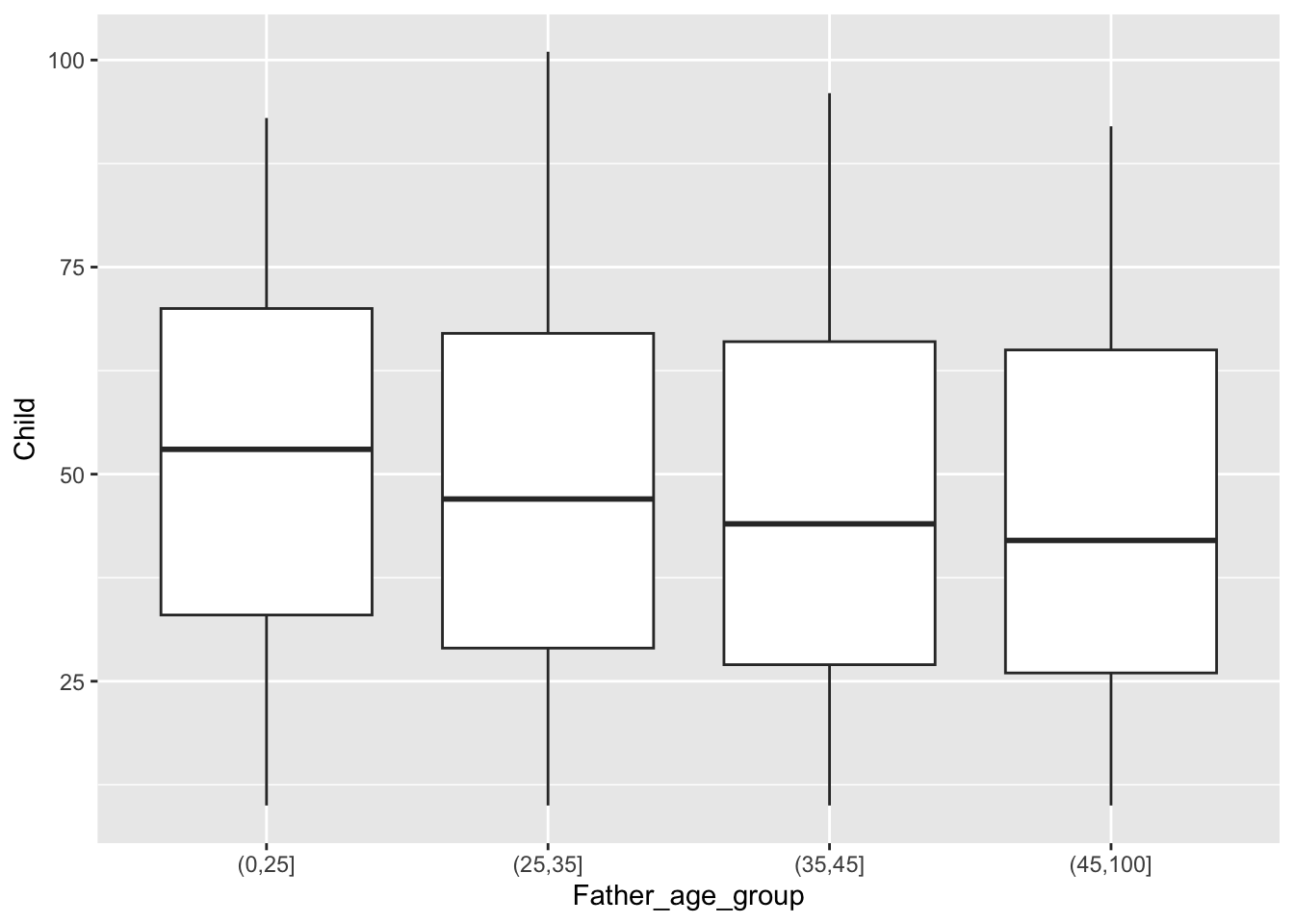
We will revisit this dataset in later chapters but, for the moment, we can complete the informal investigation of trend by using medians rather than means. In fact, the simplest way to do this is to display boxplots. This tells a similar story.
Summary
For groups of data on a single variable on a continuous scale, the histogram is a very useful method of visualisation. Features to look out for include:
- unimodal or multimodal shape;
- symmetry or skewness;
- outliers (unusual observations);
- rounding (where observations cluster at particular values, possibly indicating a simplification in the recorded values; we did not see this in the
hydedata.).
Boxplots are based on summaries which can be helpful when comparing location, scale and skewness across multiple groups but features such as multimodality are hidden.
Dotcharts and stripcharts (not discussed here) are useful displays when the samples sizes are small.
Helpful numerical summaries of samples of measurements on a continuous scale are:
- sample means and standard deviations;
- sample medians and quartiles (and indeed other percentiles).
4.3.2 Discrete scales
Ages are on a continuous scale although they are recorded to some level of accuracy. When we look at infant mortality this is less reasonable. We should view the data on a discrete scale. A barplot is then the natural display.
Mean values make sense because a discrete scale is numerically meaningful. There doesn’t seem to be an interpretable systematic shift with Father’s age.
hyde_10 <- filter(hyde, Child < 10)
hyde_means_10 <- hyde_10 %>%
   group_by(Father_age_group) %>%
   summarise(mean = mean(Child))
ggplot(hyde_10, aes(Child)) + geom_bar() +
   facet_wrap(~ Father_age_group) +
   geom_vline(aes(xintercept = mean), hyde_means_10, col = "red") +
   scale_x_continuous("Infant age", breaks = 0:9)
# The 'scale_x_continuous' function allows the axis ticks and label to be specified.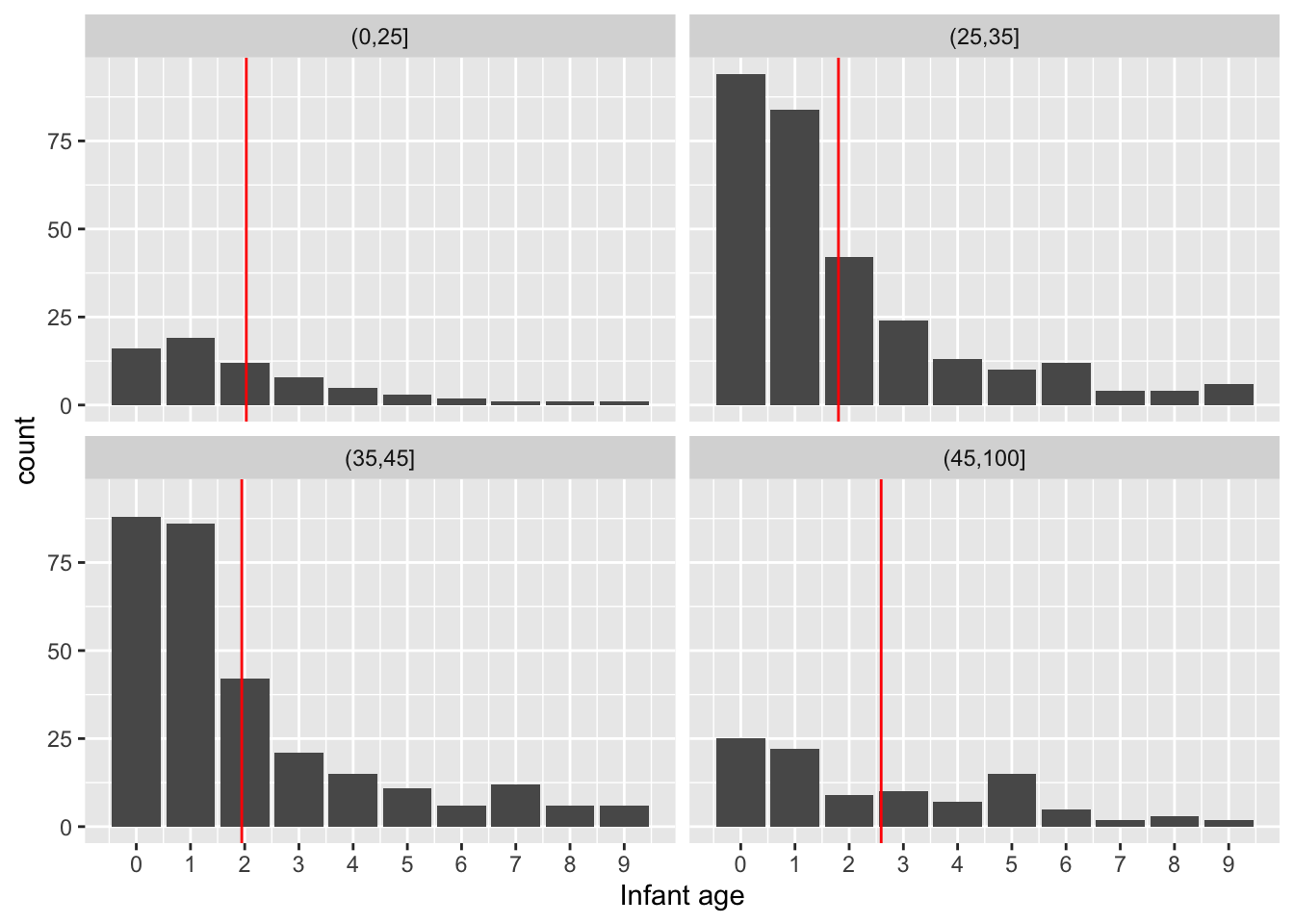
As we are dealing with counts and the number of categories is modest for both child age and father’s age group, an interesting alternative display is a mosaicplot. This uses blocks whose areas are proportional to the count in each cell of the cross-classification. Here the width of each column of blocks represents the differences in the numbers of observations in the Father’s age categories, while the positions of the breaks between the vertical blocks correspond to the proportions of child ages within each column. This is a very neat way of representing the information in the table in an interpretable manner.
tbl <- table(Father = hyde_10$Father_age_group, Child = hyde_10$Child)
mosaicplot(tbl, main = "")
# chisq.test(tbl)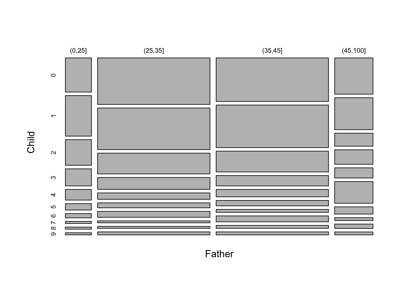
4.3.3 Categorical data
When we have more than two factors or grouping variables a contingency table is a useful way of presenting the data. The table of father and child ages shown above, for children who died before 10 years, is an example. As a further example, we can consider whether the incidence of infant mortality, irrespective of particular age of death, changes with paternal age. This is the missing part of our analysis, which so far has only considered the patterns within the infant and adult death groups.
The mosaicplot below suggests that the proportion of infant deaths may be rising slightly with father’s age.
hyde <- mutate(hyde, infant_mortality = factor(Child < 10))
tbl  <- table("Father's age" = hyde$Father_age_group, "Infant mortality" = hyde$infant_mortality)
mosaicplot(tbl, main = "")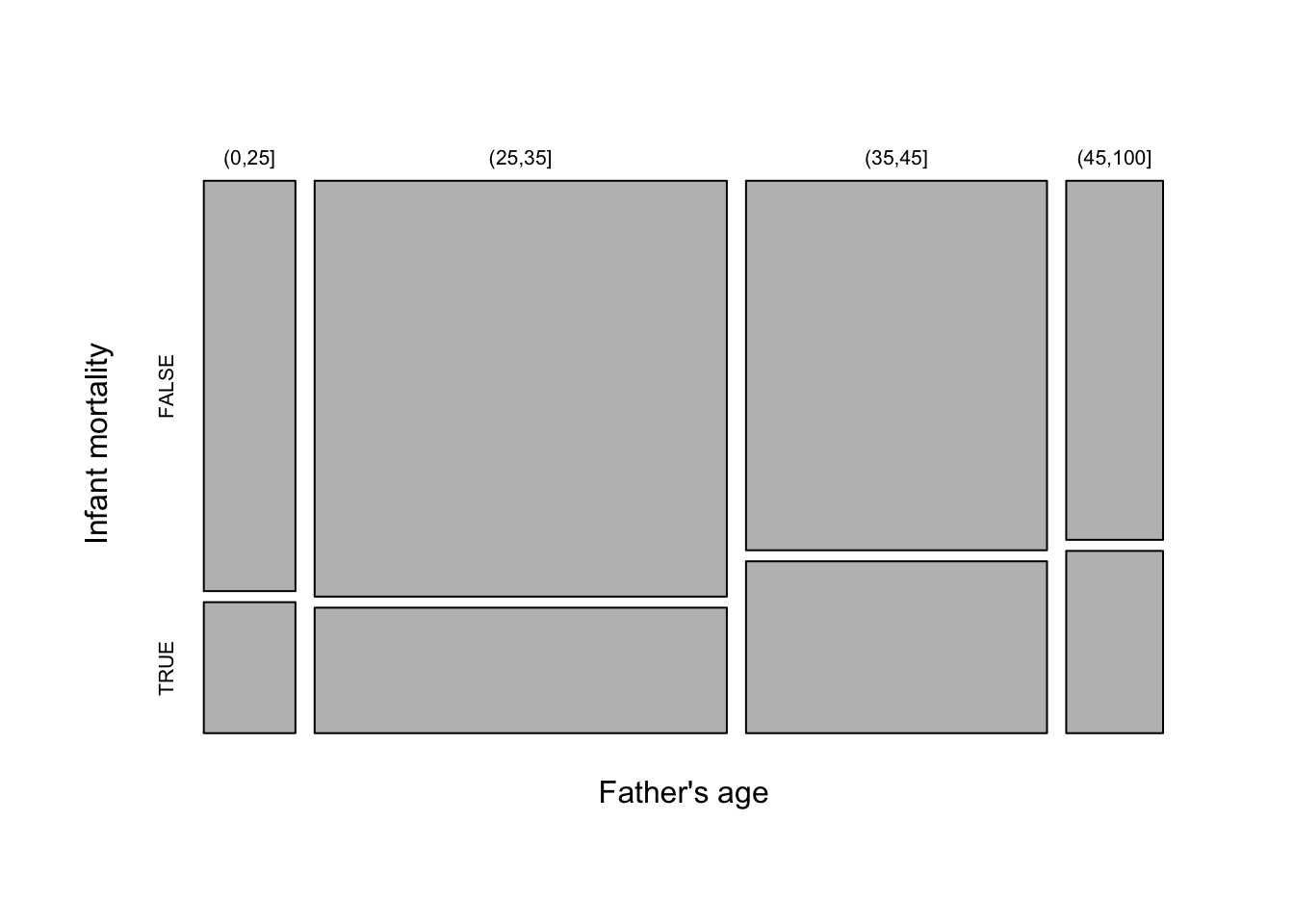
The ggmosaic package allows mosaicplots to be produced within the ggplot2 framework.