5.1 Density estimation
In statistical modelling, principal interest often lies in mean values or model parameters. However, there are some situations where the shape of the variation is itself the focus of attention. Here is an example on the development of aircraft technology.
Example: The development of aircraft technology
How did aircraft technology develop during the 20th century? Jane’s (1978) documents aircraft design for the first three quarters of the century. Saviotti and Bowman (1984) developed methods to track the evolution of these designs, using simple physical characteristics:
- total engine power (kW);
- wing span (m);
- length (m);
- maximum take-off weight (kg);
- maximum speed (km/h);
- range (km).
The data are available in the
aircraftdataframe in thesmpackage. The year (Yr) of the first appearance of each design is also provided, along with a broad categoriation (Period`) into three periods (1 - 1914-1935, before the Second World War; 2 - 1936-1955, across the Second World War and its immediate aftermath; 3 - 1956-1984, the post-war period)
A brief look at the data suggests that the six measurements on each aircraft should be expressed on the log scale to reduce skewness. The code below uses the across function inside mutate to apply the log function to all the data in the specified columns.
The left hand plot below shows a histogram of the Speed variable for Period 3, which corresponds to the years after the second World War. The pattern of variability shown in the histogram suggests that there may be multiple modes, although it is difficult to judge between systematic shape and the inevitable detailed variation.
library(sm)
library(tidyverse)
aircraft_log <- aircraft %>%
   mutate(across(3:8, log), Period = factor(Period))
aircraft_log_3 <- aircraft_log %>%
   filter(Period == 3)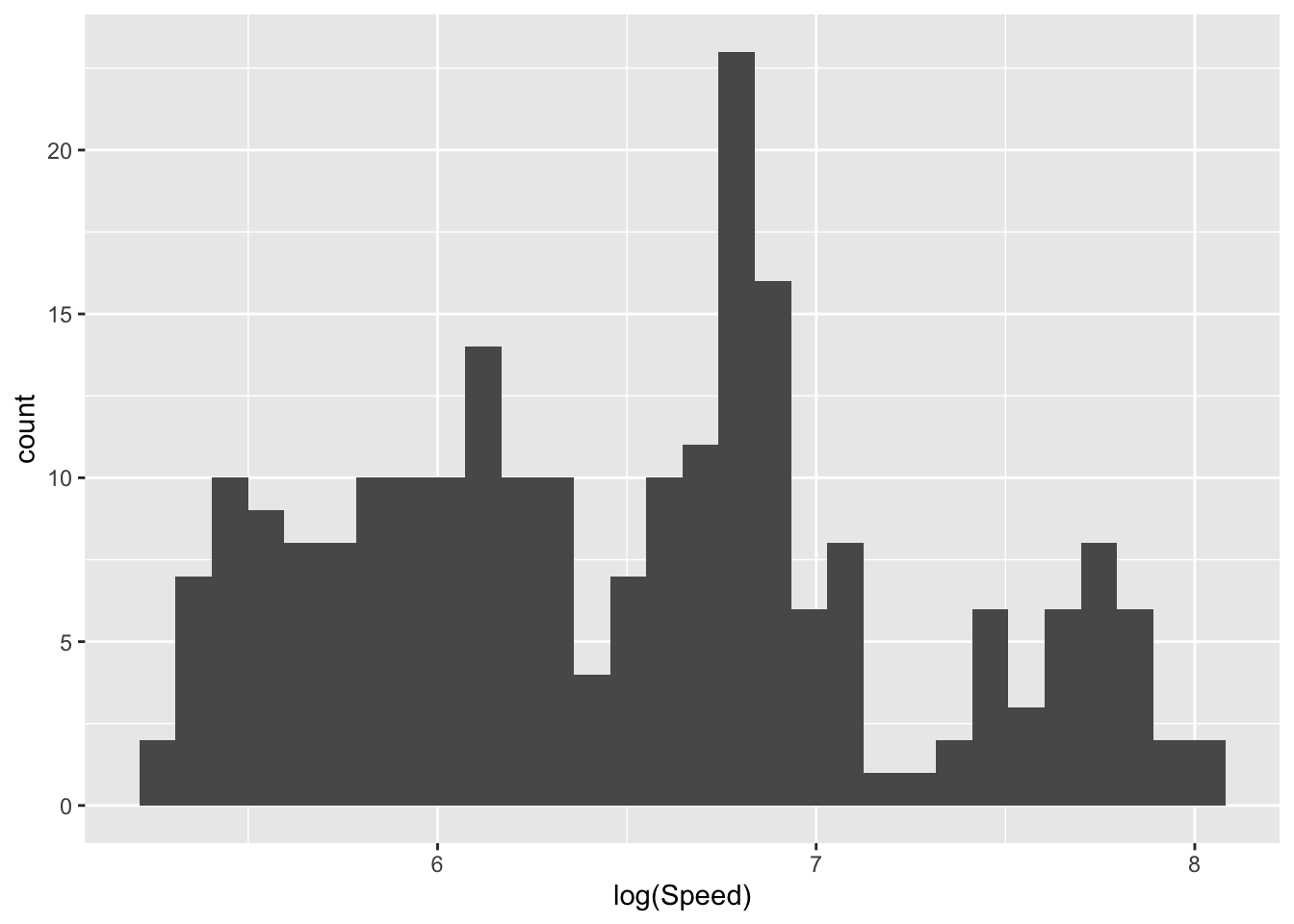
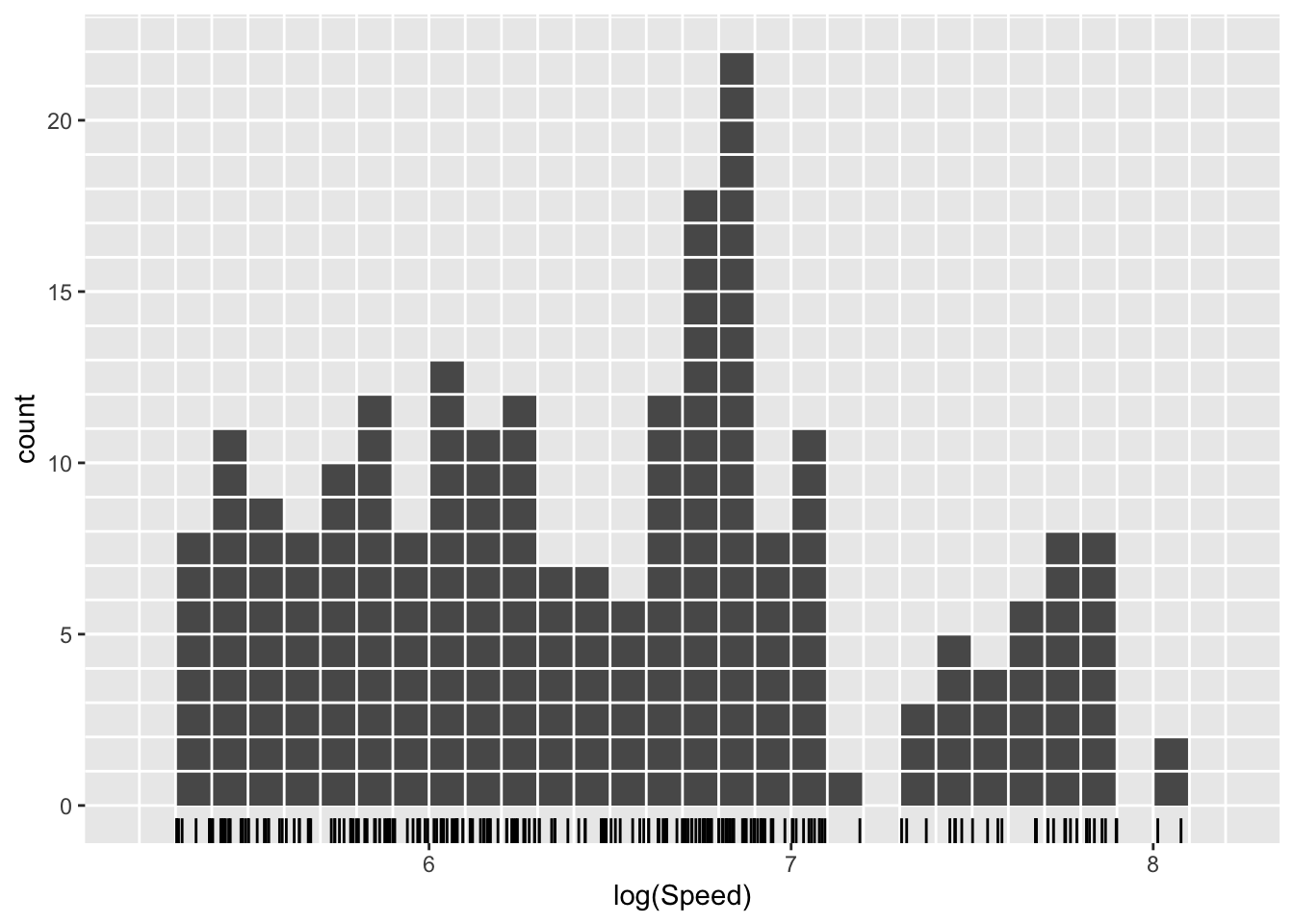
The right hand plot above shows a histogram of the same data with minor changes in the settings: the intervals used for the histogram ‘bins’ have been specified through brks <- seq(5.2, 8.2, 0.1) and then passed to the histogram geometry by geom_histogram(breaks = brks). The width of the bins is very similar and the positions have simply been moved slightly to align with neat positions on the axis. The effect of this minor change on the detailed shape of the histogram seems surprisingly large. Other additions to this plot help in understanding why. A rugplot has been added at the bottom of the histogram by adding geom_rug(sides = 'b') to the ggplot layers. The gridlines placed over the plot (code not shown) highlight the fact that each observation has an associated ‘box’ placed over the interval in which the observation lies. As the placing of these intervals (or ‘bins’) changes, the boxes shift abruptly as observations fall in or out of different bins. This is a little unsatisfactory. From another perspective, it also loses a little information in the data as we throw away the precise location of each observation and use simply the location of the bin in which it lies.
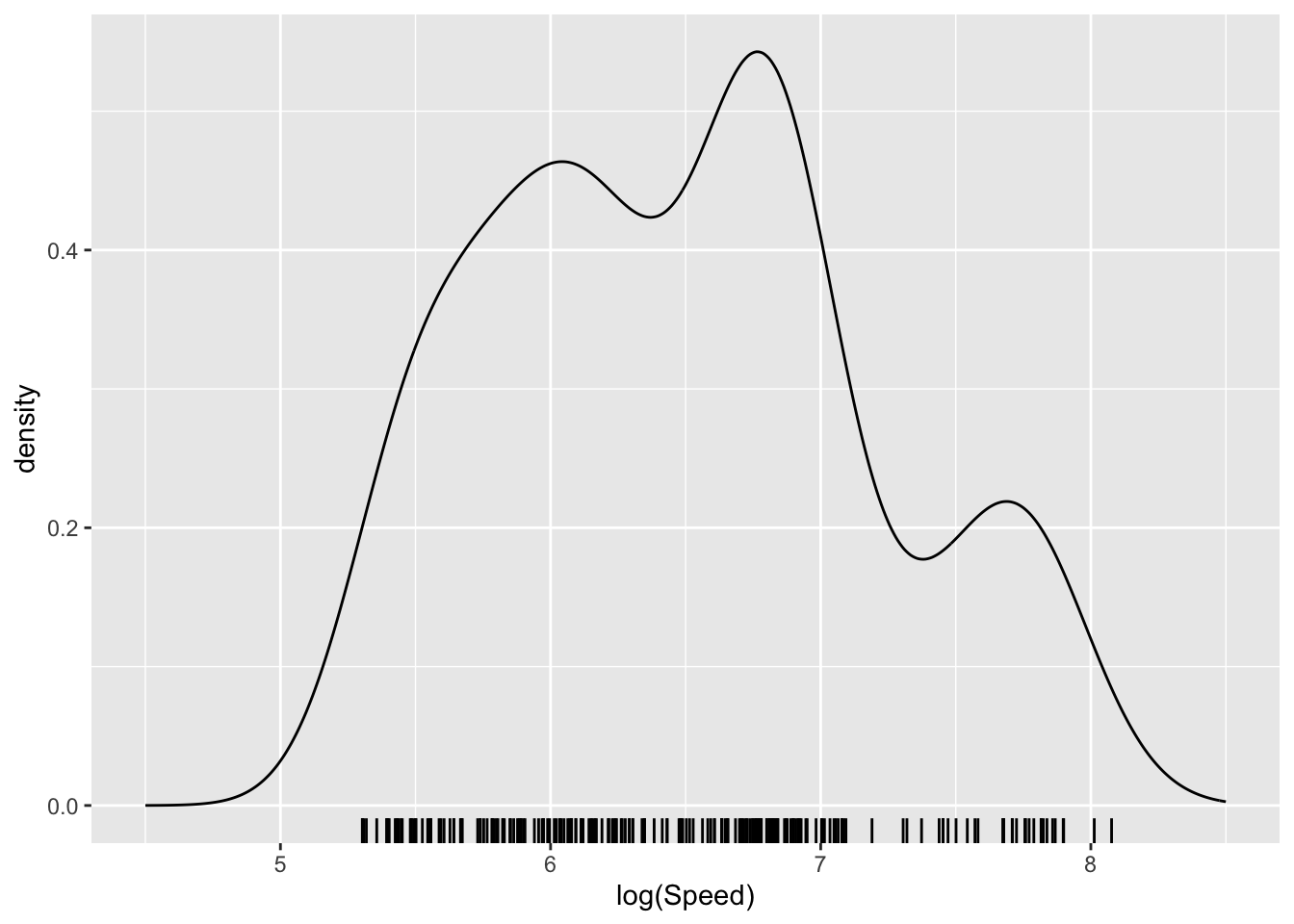
One way of addressing this is to use boxes whose centres lie directly over each observation. A further modification is to replace the sharp edges of the box with a smooth shape (referred to as a kernel function) which will blend the information across the dataset to create a smooth pattern. The left hand plot below illustrates this (code not displayed) using a small sub-sample of the data so that the effects of each observation can be seen. When the kernel functions over the observations are added together, a smooth pattern emerges. This is referred to as a density estimate as it reflects the density of data across different locations on the axis. The right hand plot apples this to the full sample, through the geom_density() layer, resulting in a smooth representation of the underlying pattern.
aircraft_log_3 %>%
   ggplot(aes(Speed)) + geom_density() +
      xlim(4.5, 8.5) + xlab('log(Speed)') + geom_rug(sides = 'b')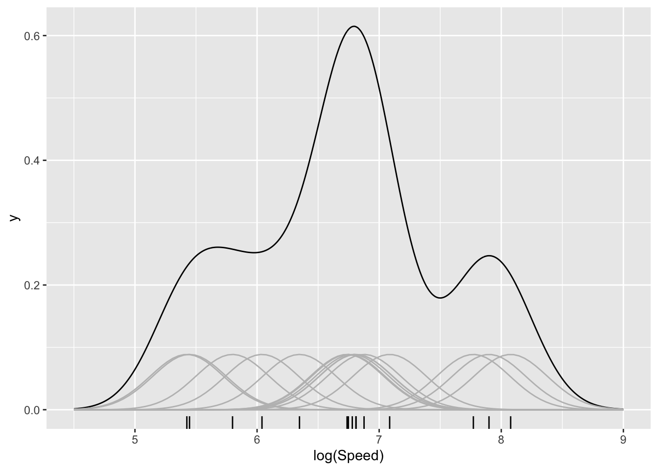
There remains the issue of choosing a bandwidth to control the smoothness of the density estimate, through the breadth of the kernel function. If this is not specified, geom_density tries to make a good choice, but it can be valuable to look at the effects of applying different levels of smoothing. This question is the early manifestation of an issue which will reappear often in later discussions of model building, namely how complex should a model be. At this stage, in the simple setting of exploring data visually, the issue is not a pressing one. Indeed it is perfectly reasonable to view the data at different levels of smoothness to inspect the patterns which emerge at different scales. Approaches to decisions on complexity will be deferred to Chapter 12.1 in the context of more extensive model building.
aircraft_log_3 %>%
   ggplot(aes(Speed)) +
      geom_density(aes(linetype = "0.2"), bw = 0.2) +
      geom_density(aes(linetype = "0.1"), bw = 0.1)  +
      geom_density(aes(linetype = "0.5"), bw = 0.5)  +
      xlim(4.5, 8.5) + xlab('log(Speed)') + geom_rug(sides = 'b') +
      scale_linetype_manual(name = "bandwidth",
             values = c("0.2" = "solid", "0.1" = "dashed", "0.5" = "dotted"))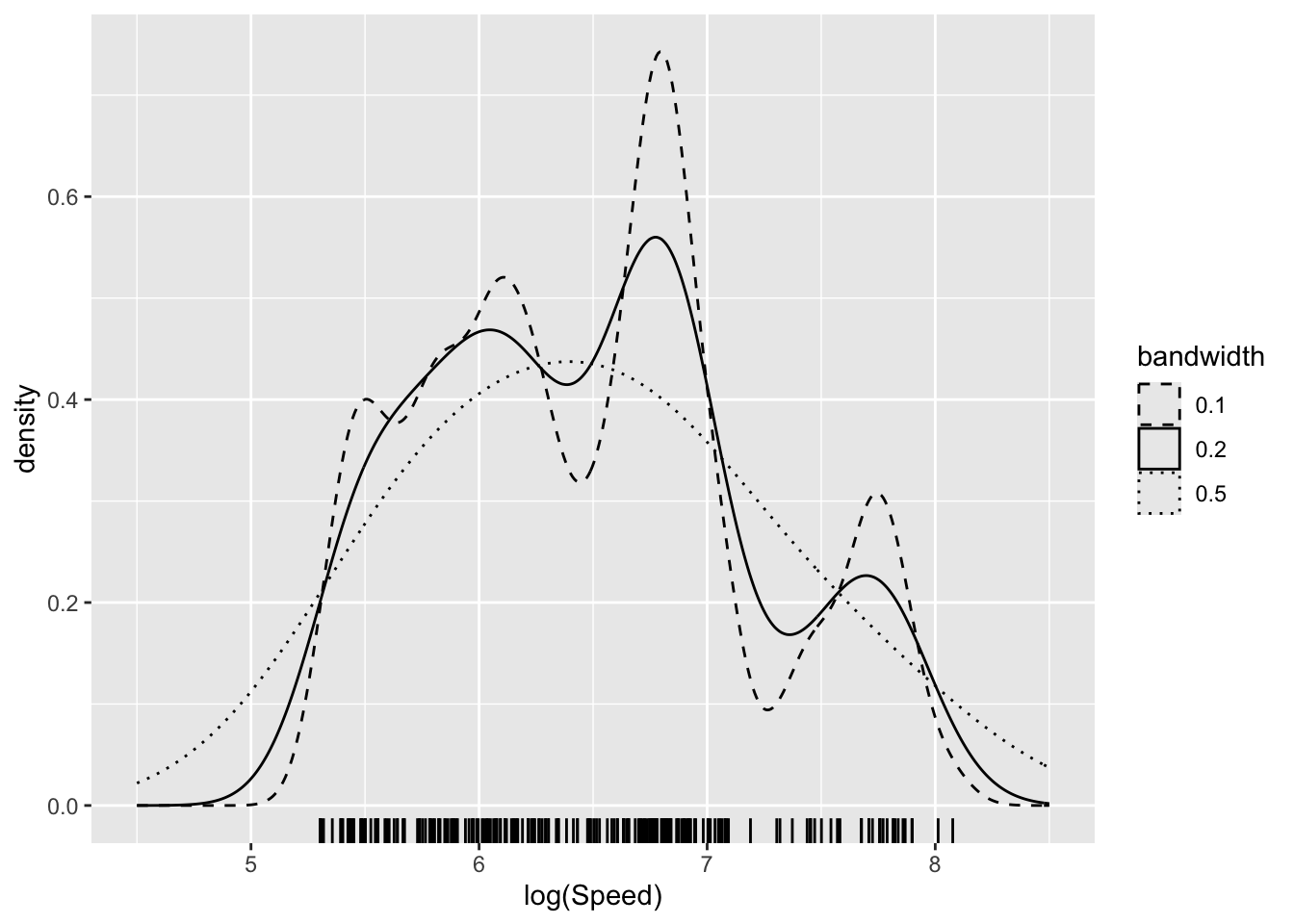
An interactive display which allows animation across different levels of smoothing is available in sm.density function from the sm package.
One advantage of density estimates is that it is a simple matter to superimpose these to allow different groups to be compared. Here the groups for the three different time periods are plotted using colour fill (fill) and transparency (controlled by alpha which lies between 0 and 1) to enhance the comparison. There is a systematic movement to higher speeds from period 1 and 2 while in period 3 further increases may be specialising into particular designs, reflected in the multiple modes.
aircraft_log %>%
   ggplot(aes(Speed, col = Period, fill = Period)) +
      geom_density(alpha = 0.5) + xlab('log(Speed)')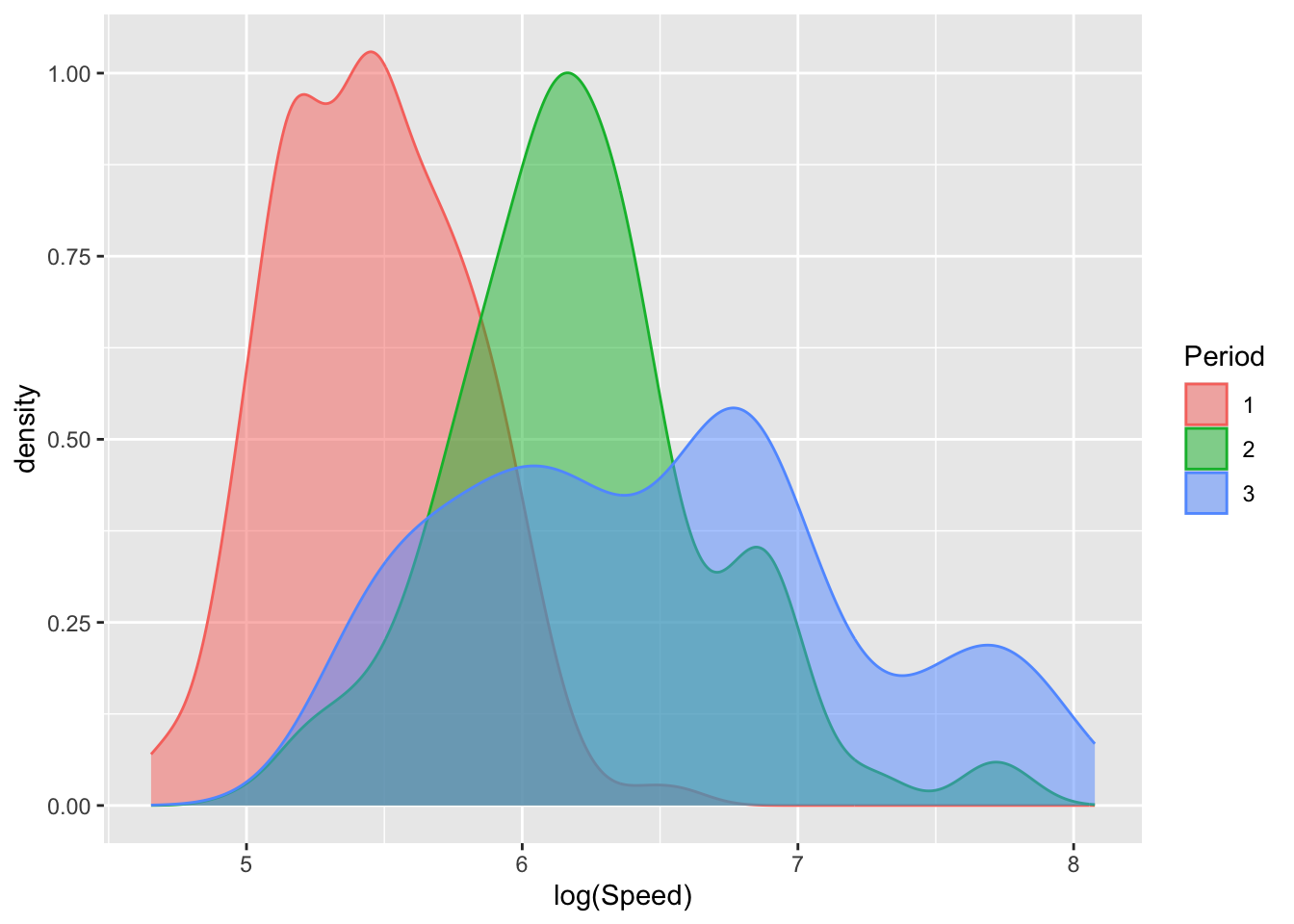
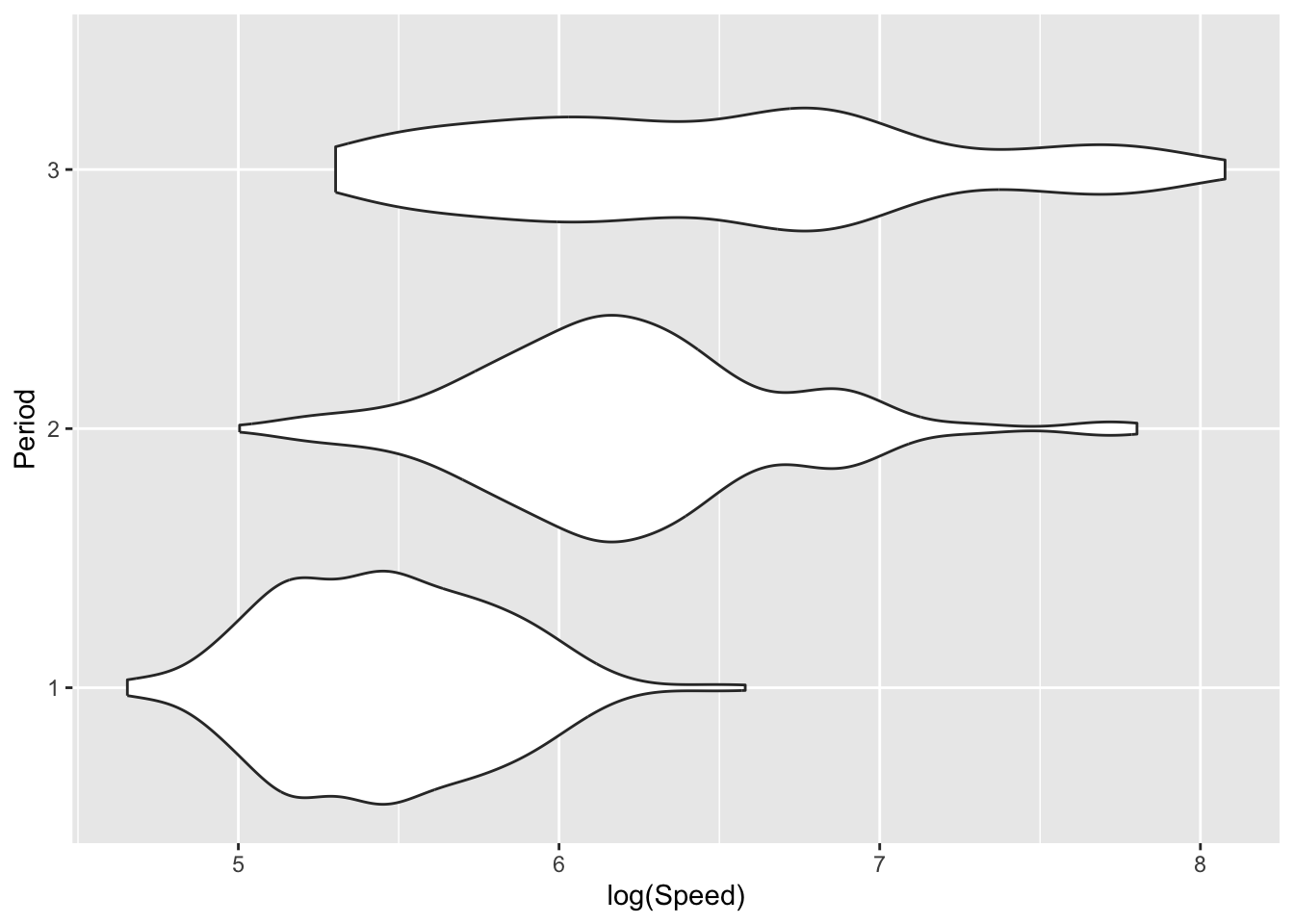
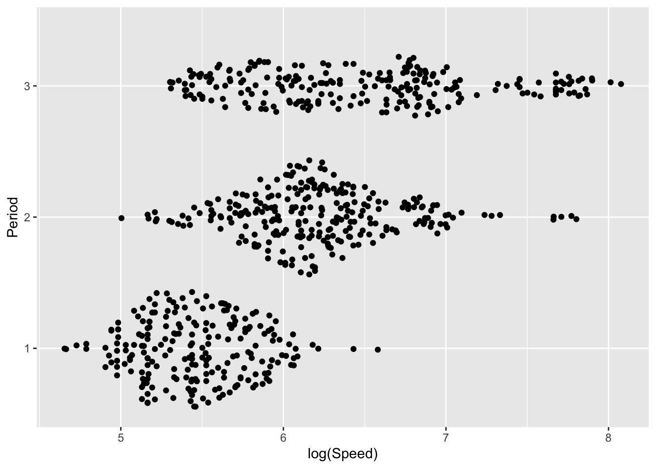
There are other ways in which density estimates can be displayed. The plots below use density ridges (Wilke 2023) and violin plots (Hintze and Nelson 1998) to display the information in innovative ways. The sina plot from the ggforce package uses jitter to separate the observations vertically, with the width of jitter controlled by the denisty estimate. This provides a display which achieves an attractive combination of raw data and underlying trend.
library(ggridges)
library(ggforce)
ggplot(aircraft_log, aes(Speed, Period)) +
   geom_density_ridges() + xlab('log(Speed)')
ggplot(aircraft_log, aes(Speed, Period)) +
   geom_violin() + xlab('log(Speed)')
ggplot(aircraft_log, aes(Speed, Period)) +
   geom_sina() + xlab('log(Speed)')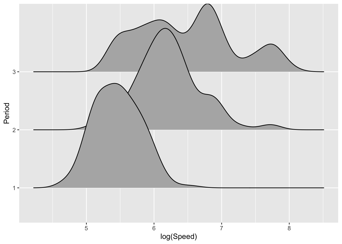
The idea of density estimation extends very naturally to a wide variety of other types of data and sample spaces. For example, in the case of two-dimensional data on continuous scales, a smooth two-dimensional kernel function is placed over each observation and these are accumulated to provide a smooth two-dimensional density estimate. The plots below show Speed and Span from period 3 of the aircraft as a scattterplot and two forms of density estimate displays.
ggplot(aircraft_log_3, aes(Speed, Span)) +
   geom_point() + labs(x = 'log(Speed)', y ='log(Span)')
ggplot(aircraft_log_3, aes(Speed, Span)) +
   geom_density_2d_filled() + labs(x = 'log(Speed)', y ='log(Span)')
aircraft_log_3 %>% select(Speed, Span) %>%
   smoothScatter(bandwidth = c(0.2, 0.2),
                 xlab = 'log(Speed)', ylab ='log(Span)')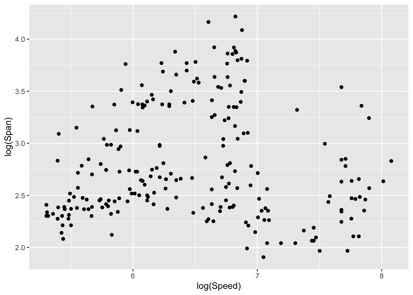
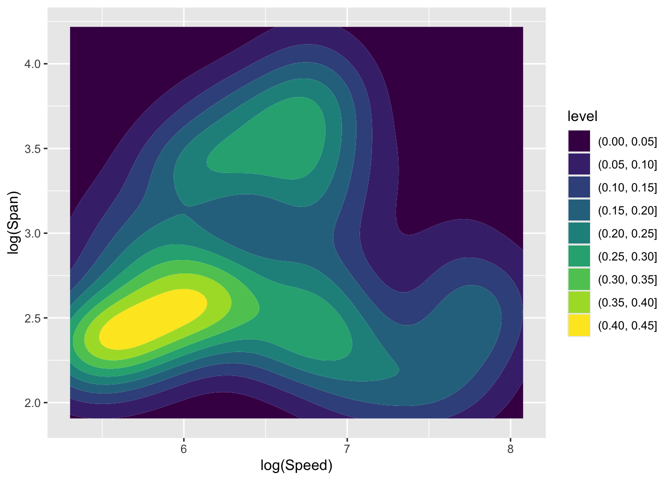
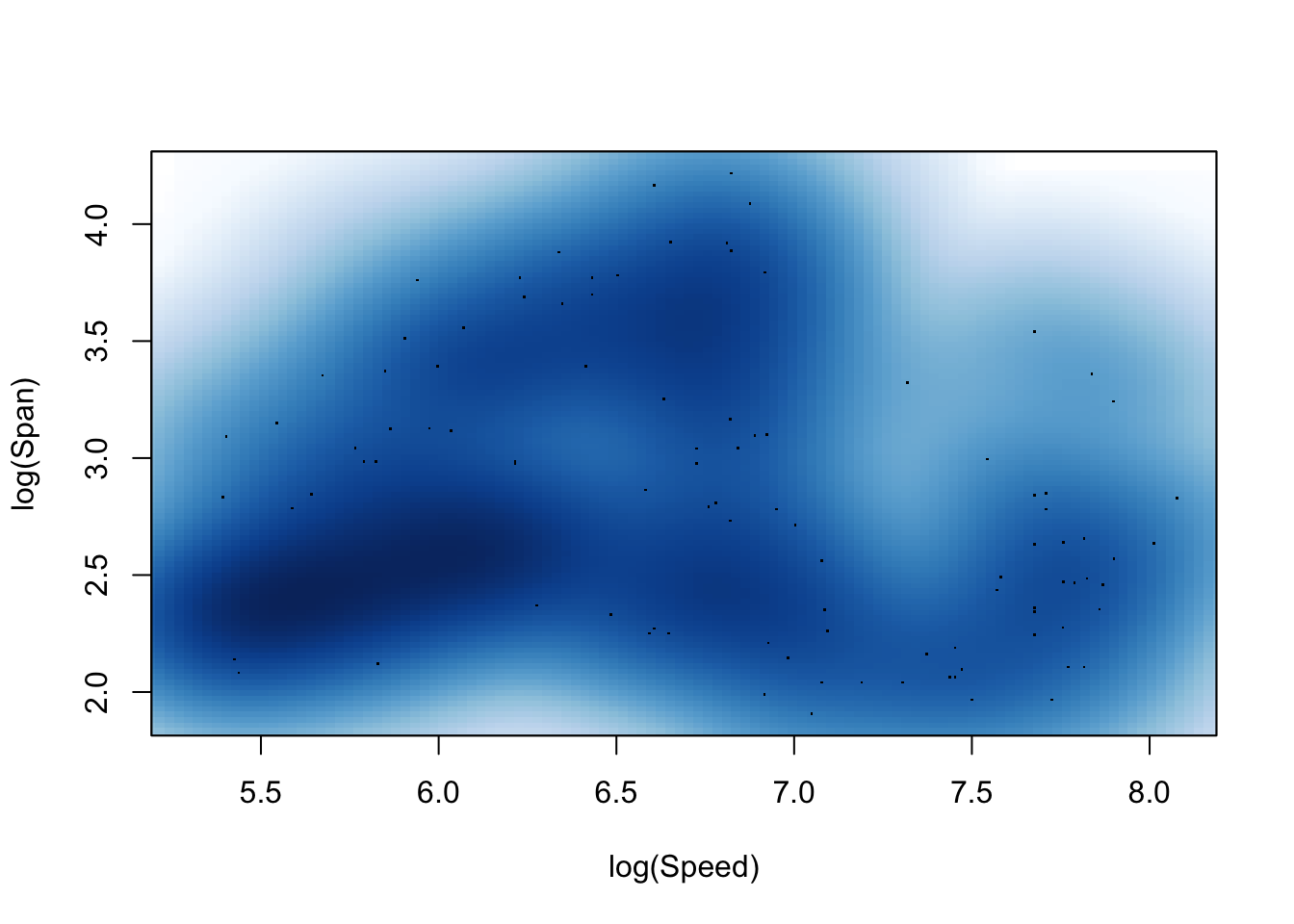
As in the one-dimensional case, the sm.density function from the sm package allows the effect of different bandwidths to be explored dynamically.
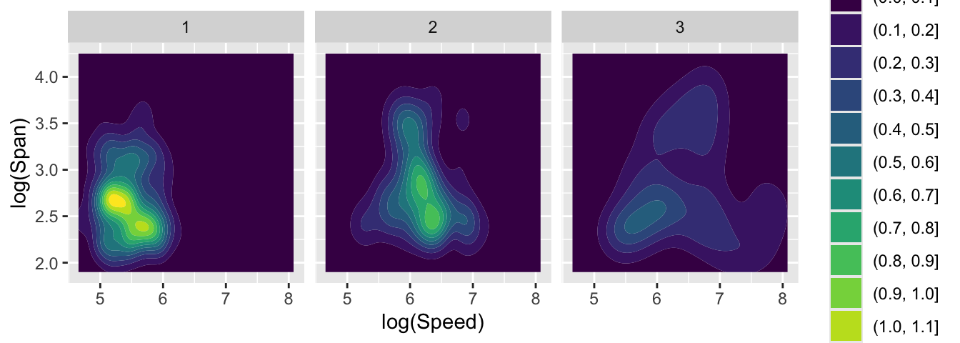
Finally, here is a comparison of the patterns of Speed and Span across the three periods, showing the evolution of these aspects of the designs.
ggplot(aircraft_log, aes(Speed, Span)) +
   geom_density_2d_filled() + xlab('log(Speed)') + ylab('log(Span)') +
   facet_wrap(~ Period)